This Site
The Site Itself
Applies to any product decision centered around empowering and trusting users with making choices on information you provide.
Most portfolio sites are brochures. A homepage, a list of projects, a resume underneath. That's a reasonable default, but it doesn't do anything, it just displays. Given that everything else I'd built argued for a specific belief, that AI should take the repetitive part and protect the part that needs a person, building a static brochure to hold that argument would have been its own kind of contradiction. The site needed to actually work the way I was claiming systems should work, not just describe it.
There was also a narrower, more practical problem. Six case studies, two personal builds, one published research paper that set my career in motion: how does someone find the one relevant to what they actually care about, without me guessing what that is in advance and building a page for every possible visitor?
A navigation system built in harmony with philosophy. The theme of this website reflects my personal view on connection between people and ideas. To symbolize this, the background features gently moving nodes and edges. I wanted to design the navigation to reflect this, and make it front and center for the purpose of:
- Concept: establishing the idea that ideas, product sense, and structural patterns connect and reinforce each other to make for a coherent and thoughtful product every time.
- Navigation: rather than having a dropdown bar that makes the user open several subpages and punishes the user for letting their cursor drift off, I wanted something that helps them identify where they want to go a lot faster.
- Description: allow the user to hover to see a description of the node before they actually navigate to it.
Two personal projects, embedded live. Static images prove a project existed. A working iframe proves it still works, right now, in front of whoever's looking. Where the embed held up cleanly, I used it. Where it didn't, a clean screenshot carried the point instead, since a broken embed is worse than no embed at all.
Semantic search: a concept I'm very familiar with because of my professional experience. The goal is to let a user search on their own terms and goals instead of parsing page titles. The key is leveraging how close certain terms are, so I don't have to worry about covering all the keywords, and a reader doesn't have to read irrelevant content until they get to the right page. Here is how I did it:
- Hybrid search: generate embeddings using OpenAI and merge both dense and sparse retrieval. This covers both conceptual searches ("experience with launching zero-to-one products") and specific terms ("governance", "agentic orchestration", "LLM").
- Storage: save the vectors in a database, and define when they need to be regenerated, and for which page.
- User search: when a user searches, both retrieval paths kick off simultaneously, the results are merged via reciprocal rank fusion, and Claude provides a short line about why that page is relevant.
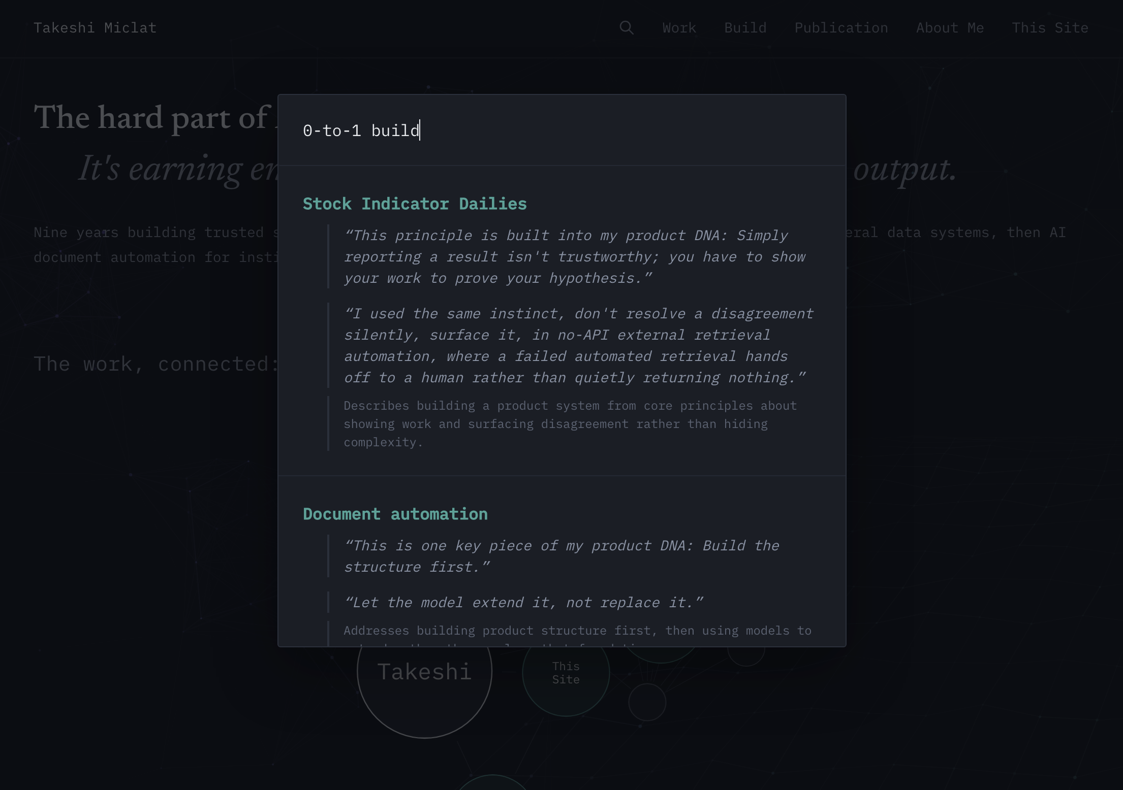
The search feature is where the site's own thesis got tested against itself, immediately.
First: why semantic search and not a chatbot, when a chatbot could give even more detail not on the website by providing enrichment information, like tech stack for personal builds or more industry-specific terms to hit the right buzzwords?
A user makes an explicit search, and searches are inherently structured. Why wouldn't they want to save time by viewing the most relevant page or pages? It is my belief that rather than responding with an unstructured collection of text, I want to give a structured, clean response that comes with rationale as to why that page was selected. The user should be able to quickly verify that the search did its job, regardless of how "fancy" the search is.
It would be irresponsible to try and include keywords not actually present in what I wrote. Doing that doesn't invest trust in readers and their ability to gauge connections between my work and their industry or domain. I believe that users should be able to verify this in writing on this website.
Second: why embedding search at all rather than normal text search, and why hybrid search specifically?
Using only text search, or only one type of embedding, runs the risk that a user enters a term that isn't covered and that immediately reads as a ding on my perceived skillset, something I don't have, even if a slightly different term would have pointed them to the right page. That's why, after talking with recruiters, other PMs, product designers, and frontend engineers, I implemented hybrid search: to cover the different ways people actually search, literal, related-term, and conceptual. The same thing applies to how people describe wine or cocktails, according to friends of mine who are sommeliers or work in fine dining.
I think about the world in a symbolic way: connections, exchanges, and patterns that repeat, challenge, and strengthen each other.
The moving nodes in the background are also partly an homage to the main menus of Metal Gear Solid 1 and 2, whose themes and aesthetic mesmerized me from when I was younger until even now.
My work is no different, whether it's work I do for a company, academic research I read and write, or a system I build on my own time. I view my work in direct alignment with how I live my life. It's all about the connections, the exchanges, and the thoughtfulness that permeates every decision.
Everything on this website is the very same philosophy as the one on About Me. A search box on a personal website and a financial document aren't the same stakes, but the instinct underneath is identical: don't let a model's confidence stand in for a person's judgment, and don't build the convenient version if the convenient version quietly takes a decision away from someone who should be making it themselves.
A portfolio site is a product too. Someone develops it with limited time to allocate, and users actively form a real opinion about whether to trust the person behind it. It deserved the same bar as anything else here:
- Structured enough in navigation.
- Honest about not building shortcuts that reference information not on the website.
- Built the same way I'd want to be judged for building any other product.